8 Raster Data in GEE
Let’s build a foundation. This section is riddled with terms you may, or may not, have ever heard. Even if you have heard of them, it’s not going to hurt to have a refresh. Instead of just giving a lexicon of terms for you to memorize, I want to do things in context. Any fool can give you a list, but your sensei will do better than that!
As humans, we have several tools we employ to investigate our surroundings. On a basic level, we can touch things. Objects have texture. You can easily tell the difference between a cat and pavement just by the way it feels. Likewise, you can tell the difference between a lemon and an olive by the way it tastes. In your mind, you’re tasting these things now, aren’t you? You have a sensory memory that allows you to recall these things. We’ll get to that later. What I want you to focus on is that both touch and taste require direct contact with the object to investigate it. This is direct sensing. But wait! There’s more. You have a couple other faculties that we haven’t discussed: sight and sound. Both of these are powerful tools that allow us to observe an object from a distance. Let’s drop sound for confusion-sake, but suffice it to say that we don’t have to stick our ear directly on something to hear it. If you have good vision, or corrected vision, you can see things for a pretty big distance, even miles in some cases. Being able to detect something from a distance is called remote sensing. Take a moment and think about what our eyes are we actually seeing…I’m serious here, when you SEE something, what exactly are you viewing?
Go into a closet, or any other space without windows. Take a look around at things. You’re making mental notes about the shape and color of various items. Now, turn off the light. Does the shape and color change? Technically, the shape stayed the same, but you’re not able to view it. What happened to the color? It’s gone. Without a source of light, the color went to black (or the absence of color). So, go back to the original question and meditate. You should come to the enlightened state that what we are seeing is in fact the reflectance of light. Various materials, dyes, pigments, etc…, absorb certain types of lights and reflect the rest. When you see green, all but the green light has been absorbed and the green light has been reflected. What is the source of light? Well this depends. In the closet, it’s the lightbulb. Outside, it’s the sunlight.
Let’s take a view of the Earth over Edinburgh. Go back to Chapter 1 and create that variable, for a point, that represents the center of Edinburgh. If you can do this without looking, you’re gaining great in strength. If not, no sweat! Do a few more reps and review that section. If you need a hand, here’s ONE example of how to get the world centered over this city:
Example 2.8.
- var Edinburgh = ee.Geometry.Point(-3.1883, 55.9533);
- Map.centerObject(Edinburgh, 8);
If you missed what’s going on with Map.centerObject, go back and look at the hint at the end of Chapter 1. Alternatively, you can use this routine:
Example 2.9.
- var Edinburgh_location[-3.1883, 55.9533];
- Map.setCenter(Edinburgh_location[0], Edinburgh_location[1], 8);
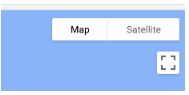
Now switch the view from Map to Satellite using the button in the upper right portion of the mapping area:
If everything worked right, it should look like this:

Just like most of our modern mapping applications, we can switch between map views and satellite views. This is useful! Now we’re getting somewhere. Take a moment and write a script to center the map on Bueno Aires, Argentina. Don’t forget to set the zoom to a level that highlights what you’re trying to highlight.
The satellite view displays what I would consider a basemap. It doesn’t have a specific date or sensor (satellite) associated with it. It is likely taken with one sensor, but the dates could be all over the place. It’s great for many purposes, but at some point we will want to be able to choose the sensor, date, and even what parts of the electromagnetic spectrum (bands) to display. We may even want to apply tools to view this information or extract data directly from the imagery. This is not possible with the basemap. In the next chapter you’ll see how this is done.
Remember the example I gave with being in a closet and turning off the light? Go back to that. You already know that all light is created equal. If you don’t believe me, use your phone to take a picture of an object inside. Take the same object outside on a full-sun day, and take a picture. Now compare them to each other. If they aren’t different, then I have no idea what kind of wizardry created your phone. Why are they different? Consider the source. The sun emits a full spectrum of light, including light we cannot see. This includes things like infrared and UV:

Hopefully you’re noticing a couple things when you look at Figure 1:
- There’s boat loads of visible light. That’s the stuff we see with our eyes. It falls roughly between 380 – 700 nanometers (nm).
- The visible portion of the spectrum makes up a pretty small portion of the entire spectrum.
Now that we’ve established there are different wavelengths, sensor data lumps these into fundamental “bands.” For example, visible data from sentinel is stored into Bands 2 (Blue), 3 (Green), and 4 (Red). To get a complete visible image that makes sense to our eyes, we need to create a composite of these bands, essentially blending it all together. If we just looked at each band individually, it would be like eating a cookie one ingredient at a time.
Now we’ll put a color composite together by starting with only a portion of the script found at the bottom of the page you clicked on for surface reflectance:
Example 2.10.
- var dataset = ee.ImageCollection(‘COPERNICUS/S2_SR_HARMONIZED’)
- .filterDate(‘2022-05-01’, ‘2022-05-30’);
- var visualization = {
- min: 0,
- max: 4000,
- bands: [‘B4’, ‘B3’, ‘B2’],
- };
- Map.addLayer(dataset.mean(), visualization, ‘RGB’);
- Map.setCenter(-3.1883, 55.9533, 8)
Before running the script, let’s actually break down what each one of these lines is doing:
- var dataset = ee.ImageCollection(‘COPERNICUS/S2_SR_HARMONIZED’).filterDate(‘2022-05-01’, ‘2022-05-30’);
By now, you should likely know what Map.setCenter() and what var dataset does. You also have seen something similar to ee.ImageCollection, only it was ee.FeatureCollection. We’re just calling images, not vectors. We also need to filter things by a range of dates. You could call an individual image, but that would require you to know the exact image to call in the function. Notice later we call:
- Map.addLayer(dataset.mean(), visualization, ‘RGB’);
When we add the layer, we take the mean of each pixel across the specified dates to display. For example, let’s assume there are two images within the date range. In the first image, we look at a sample pixel and it is completely black. The same pixel on the second image is completely white. The average between the two would be gray, which is how the pixel would appear on the mean image. You also notice we set a few other parameters, specifically visualization and ‘RGB’. The ‘RGB’ is just a name we assign the layer and stands for Red, Green, Blue. Now, let’s look at the visualization object:
- var visualization = {}. This is setting a variable for the object. The name does not need to be visualization.
- min:,max:. We need to set the range of pixel values to properly color the image. Later, we might just divide this by 1000 to simplify things.
- bands:[‘B4’,’B3’,’B2’]. These are the bands we want to display. Band 4 (B4) is red and we assigned it to be colored red. Yeah, I know that’s a bit weird. It will make more sense later. Band 3 (B3) is green and Band 2 (B2) is blue.
Here’s the band assignments for Sentinel 2:
| Band | Resolution | Central Wavelength | Description |
| B1 | 60 m | 443 nm | Ultra Blue (Coastal and Aerosol) |
| B2 | 10 m | 490 nm | Blue |
| B3 | 10 m | 560 nm | Green |
| B4 | 10 m | 665 nm | Red |
| B5 | 20 m | 705 nm | Visible and Near Infrared (VNIR) |
| B6 | 20 m | 740 nm | Visible and Near Infrared (VNIR) |
| B7 | 20 m | 783 nm | Visible and Near Infrared (VNIR) |
| B8 | 10 m | 842 nm | Visible and Near Infrared (VNIR) |
| B8a | 20 m | 865 nm | Visible and Near Infrared (VNIR) |
| B9 | 60 m | 940 nm | Short Wave Infrared (SWIR) |
| B10 | 60 m | 1375 nm | Short Wave Infrared (SWIR) |
| B11 | 20 m | 1610 nm | Short Wave Infrared (SWIR) |
| B12 | 20 m | 2190 nm | Short Wave Infrared (SWIR) |
Table 1: Band assignments for Sentinel 2 (https://gisgeography.com/sentinel-2-bands-combinations/)
Now run the script. What’s the first thing you notice? It has too many clouds! Even though May is one of the least rainy months, we’re talking about Scotland. What if we want to clip it by the geography of the country of Scotland? Now you know how to access the data, the next Part will address how to extract data for a variety of analyses.
